A Framing Project: Primary Colors by Nancy Glazier,
A signed and numbered, limited edition serigraph
A signed and numbered, limited edition serigraph
|
Do you have something you've always wanted to have framed to fit your style and your home? Are you intimidated by the thought of choosing the right frame and mat to complement your artwork?
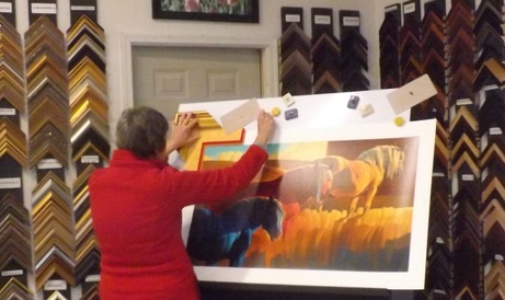
Bring it to the expert! At the ART BARN we specialize in framing beautiful art for the individual style of each customer. We will help you as much or as little as you want with the process of choosing the frame and mat for your project. Here is an example of a framing project we had a lot of fun with at the gallery: |
|
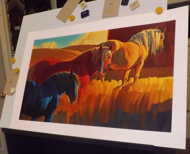
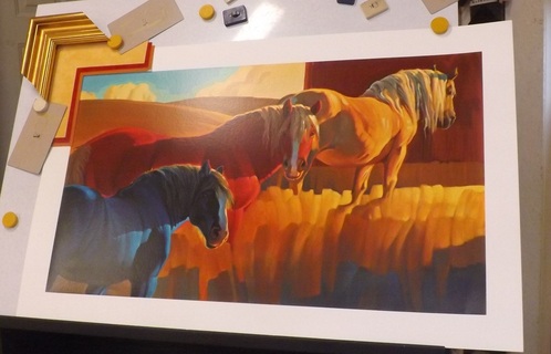
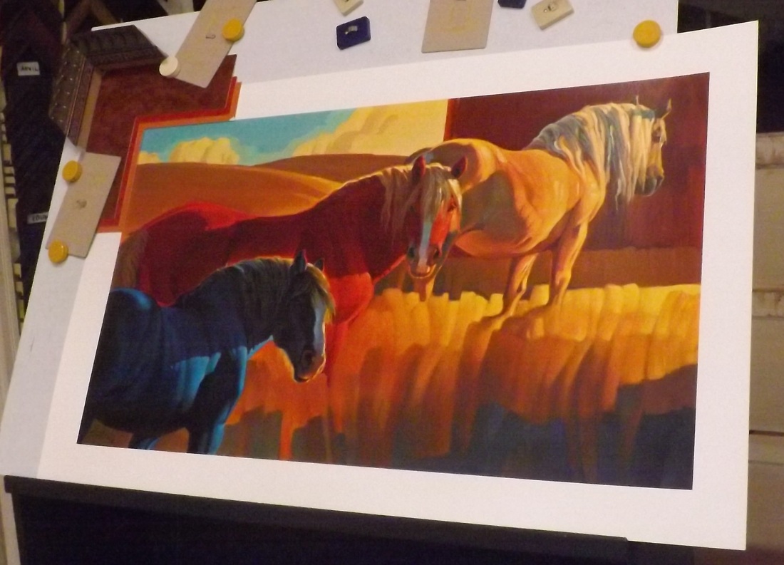
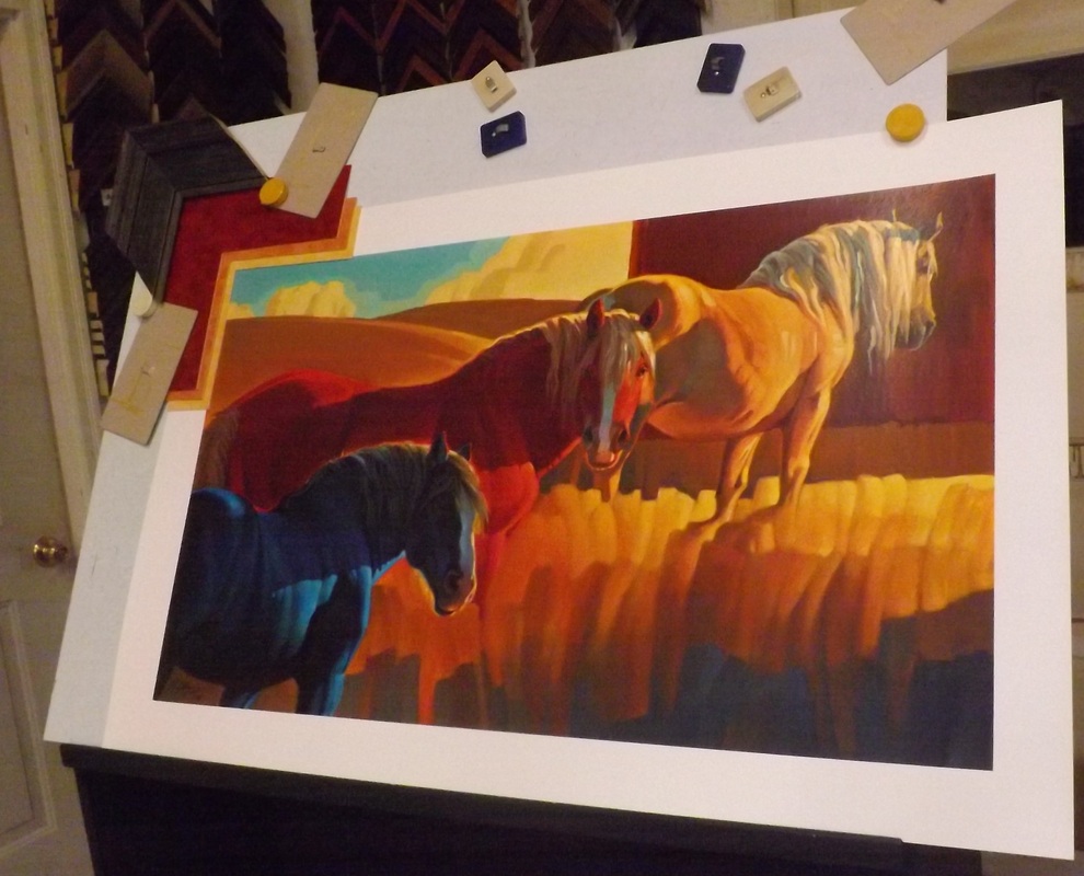
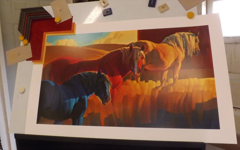
Shown is a gorgeous, contemporary picture by Nancy Glazier, entitled Primary Colors. This very limited edition has the look and feel of an original work of art.
|
The first step is to analyze the artwork. What is the "feel" of the picture, what is it saying, what elements do we want to emphasize in the picture?
|
The goal in any framing project is to ensure that the frame and matting chosen direct your eye to the picture and enhance it, not dominate it. When you first look at a picture, what do you notice? With this picture, the goal is to have your eye go immediately to the red horse in the middle. Your gaze will then roam around the picture to take in the rest of the print and the matting and frame.
|
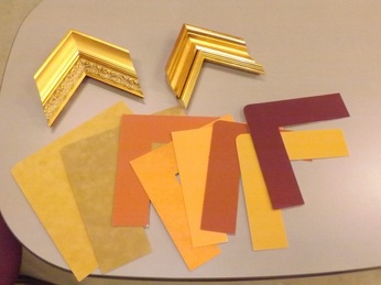
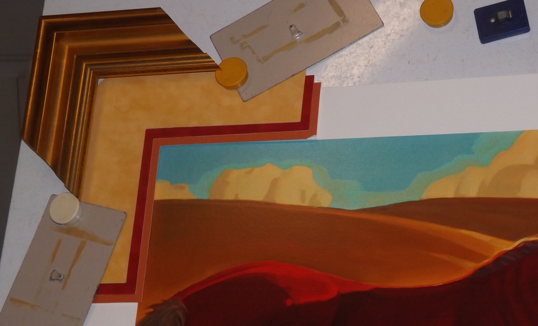
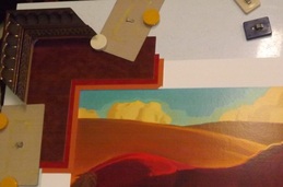
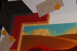
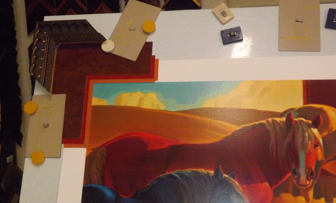
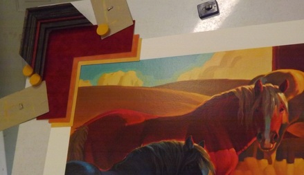
This example was a real contender. This is a stacking of two frames, and really scoops into the picture. The width is good and the linear lines of the combo echo the strong linear lines in the lower corner of the picture, as well as the horses' manes. Unfortunately, I discovered that the top mat was not available in the size needed for a picture of this size. Time to experiment some more...
|
And the winner is...
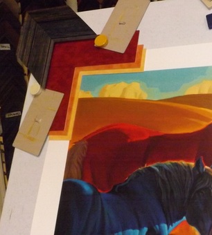
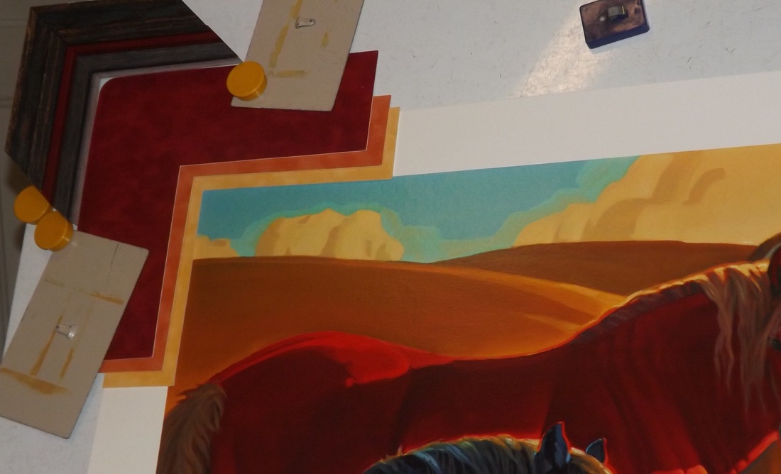
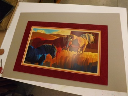
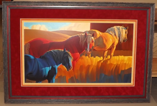
The winning combo is three stacked frames and three suede mats. The frames on the top and bottom have a very slight blue hue, which looks great sandwiched with the red frame. The width and shape of the stacked 3 combo gives presence to the picture and anchors it all around. The mat and frame together combine the elements of the picture without overpowering it.
The winning combo is three stacked frames and three suede mats. The frames on the top and bottom have a very slight blue hue, which looks great sandwiched with the red frame. The width and shape of the stacked 3 combo gives presence to the picture and anchors it all around. The mat and frame together combine the elements of the picture without overpowering it.
The result? Goal achieved! A unique picture with a unique framing. One dynamite, eye-catching, gorgeous picture!
MAT AND FRAMING ARE ORDERED ...
